BY MARILYN WILSON, THE OTTAWA CITIZEN February 4, 2016

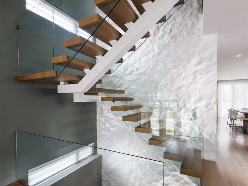
A textured wall like this one by Design First Interiors using Crush wall tiles by Modular Arts creates a great effect in the stairwell of a Westboro home.
According to Benjamin Moore, the colour of the year is Simply White. But don’t let that fool you into thinking 2016 will be bland.
“White is a perfect way to define a space in a really beautiful and sophisticated way,” says a video on the paint brand’s website.
Sherwin-Williams has also chosen a shade of white, Alabaster, as its colour of the year.
“Alabaster represents a straightforward and necessary shift to mindfulness,” Jackie Jordan, the company’s director of colour marketing, says on the website.
Which brings us to infusing your space with neutrals for a clean look this year.
Neutrals are anything but boring. If you need proof of that, check out Benjamin Moore’s catalogue, where there are more than 250 shades of white. Take that, Fifty Shades of Grey.
Introducing neutrals
There is a huge emphasis today on behaving in ways that do not negatively affect the environment. Recycling and being at one with nature are important for our survival and health. It makes sense then that in a high-stress and fast-paced world, the push to go back to basics and preserve the planet would be mirrored in home decor.
Window treatments, lighting elements and architectural details can all be chosen to accommodate this trend. In the kitchen, opt for neutral cabinetry or white subway tiles for backsplashes. In addition to being easy to keep clean, this look freshens up an interior.
Magazines and showrooms often display all-white spaces, but the fear is that when incorporated in home interiors, this look might read as boring or lacking in personality. If this is your fear, consider warming up the space with other neutral tones — grey walls, for instance, or tans in sisal rugs or linen shades, both of which add an interesting sense of texture that will warm up the space.
Restoration Hardware is a wonderful source for drapery that can look custom without the exorbitant pricing. Their Belgian Textured Linen Drapery is a favourite of mine and it comes in a variety of neutrals ranging from white and sand to fog and charcoal. And try Pottery Barn for sisal rugs — their chunky weaves add drama and comfort to any room.
When it comes to selecting tile in bathrooms or kitchens, Ciot in Montreal offers a huge variety of options. Consider textured tiles in neutral colours, which can prevent your condo from looking dated in a few years while still infusing the space with personality.
Getting personal
If you opt for a neutral palette, consider ways to imprint your own style on the space. It’s great to have your living room look ready for Architectural Digest, but better still to have it look like you.
Colourful art is one way to perk up a neutral space and have it reflect your own taste. To up the drama appeal, consider contemporary art with bold colour blocking.
You might also consider painting a feature wall a different hue to add contrast. Or texture it with brick, stone or pre-fab walls lit up from below to show that texture. Texturing is a particularly good technique if you have a lot of wall space but not much art.
Another way to create a sense of dramatic purpose is with accessories in colour pops or shades of metallic. Think how nicely black, white and other neutrals pair with gold, silver or bronze. Silk window treatments in a metallic shade dress up any room, while other elements to add could include mirrors with antique glass or thick gold frames.
You want your home to help soothe and relax you. Neutrals create a sense of cleanliness and clutter-free space that help reduce stress and are an excellent way of keeping your condo decor timeless.
Marilyn Wilson has been selling real estate for more than 25 years and owns Marilyn Wilson Dream Properties Inc. Christie’s International Real Estate. Reach her through dreamproperties.com.
© Copyright (c) The Ottawa Citizen
